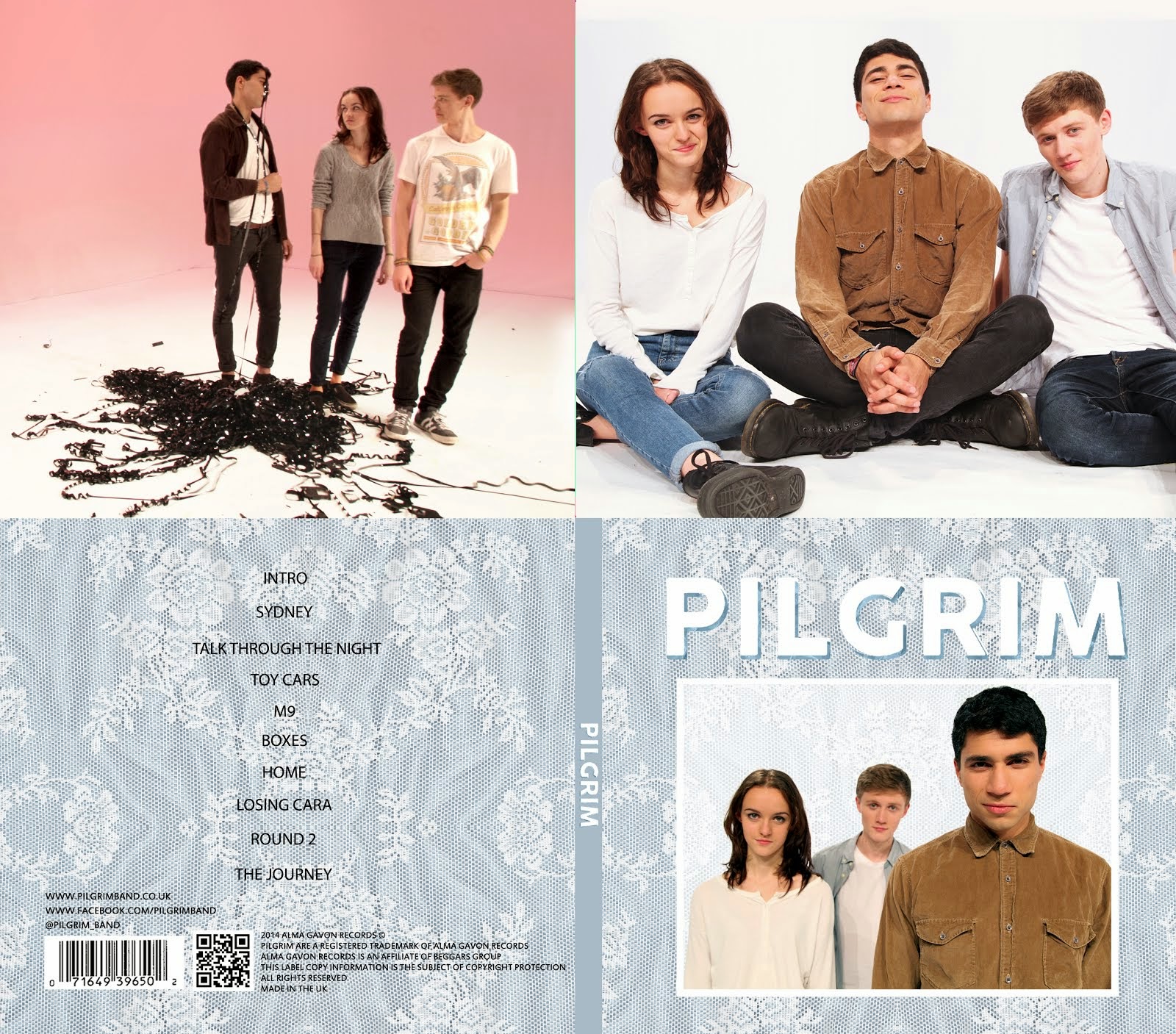
Me and Gavin were discussing what other items we could put on the store, and decided that posters are very typical of indie bands and artists, as indie fans often become very immersed in certain musicians and take their music very seriously, therefore often have posters on the walls of their room. Gavin drew up two main poster designs (right and below) based on two publicity shots we had that we thought would make good posters, one portait and one landscape. As we are a new band, we decided to use fairly conventional poster ideas with nothing too conceptual. This is also fairly typical of indie band posters, as well as strengthening our band image. The posters will be priced at around £5 to make them affordable and therefore will make more people buy them.

Me and Gavin then loaded the images on photoshop and edited them to look cleaner and more vibrant. We also added the text on top of the image, and made two copies of each poster, one with the original background and one with a textured background, shown below.
We liked these two especially going together, as the landscape one portrays a more fun, energetic band, whereas the portrait one portrays a slightly more serious band. They also connote a clear branding for Pilgrim as they have the big band name with the band font across them, and possibly will have a textured background, the same texture we use on the album cover and website.


No comments:
Post a Comment