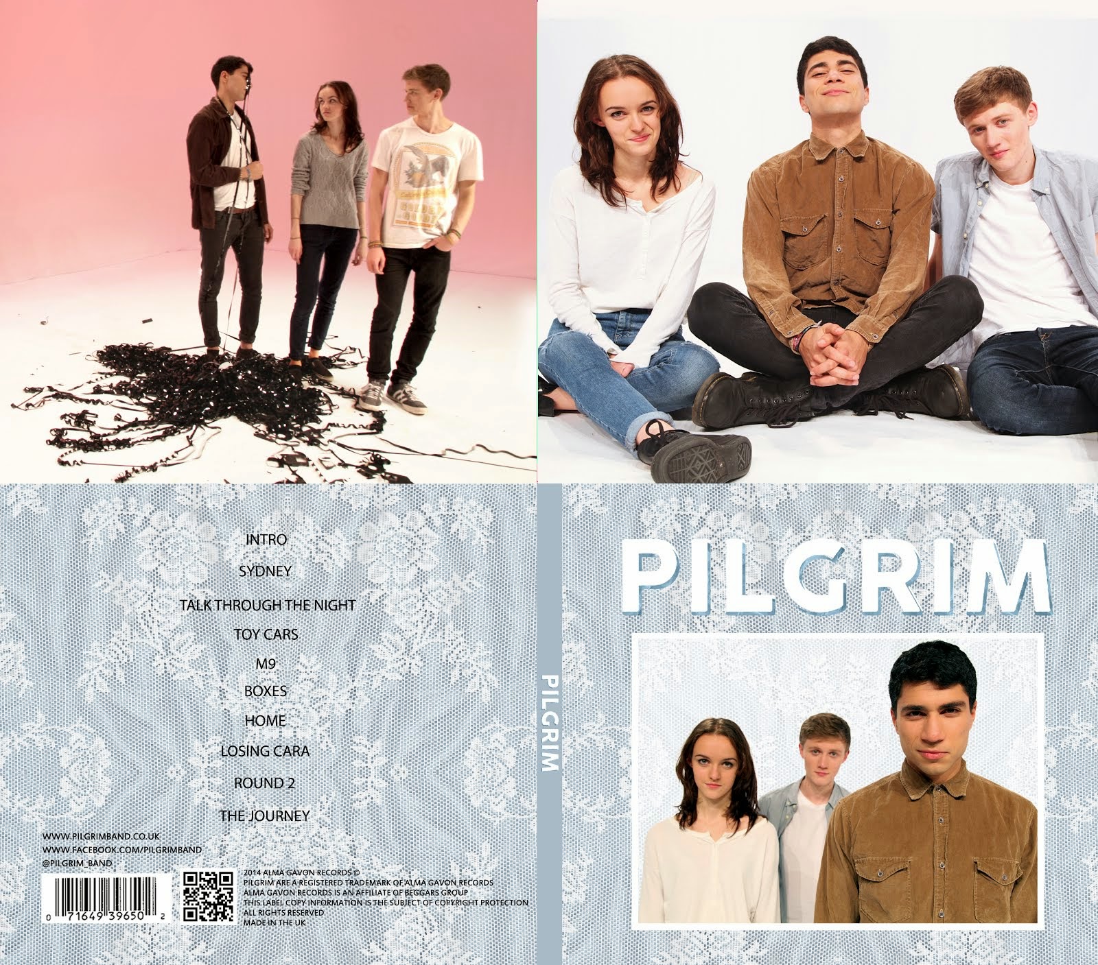
rWe had a fairly clear idea of what type of website we wanted to make, but we decided that we would like to finish or come close to finishing the album cover first so that we had a clear idea of branding with which to work with on our website. Whilst we were working on our album cover and music video, we spent some time taking influence from existing websites for bands/artists. We found a few that matched a similar format to that of which we were thinking, shown below:
Rizzle Kicks
 |
We especially liked this website, as it had links to different social media sites such as Instagram and Twitter. We also liked the simplistic layout of this website.
|
The 1975
 |
| We liked the clear colour black and white colour scheme on this website, as well as the layout and the extensive use of images in boxes. |
Dan Croll
 |
| We like the simplicity of this website, as well as the clear synergy between this and the other media texts Dan Croll has, such as a music video and his album. |
Dog is Dead
 |
| We liked the landing page that Dog is Dead use, as it can be used to quickly establish the brand/style, or promote another media text. |
We will then use these websites as influences for our own website design.


No comments:
Post a Comment