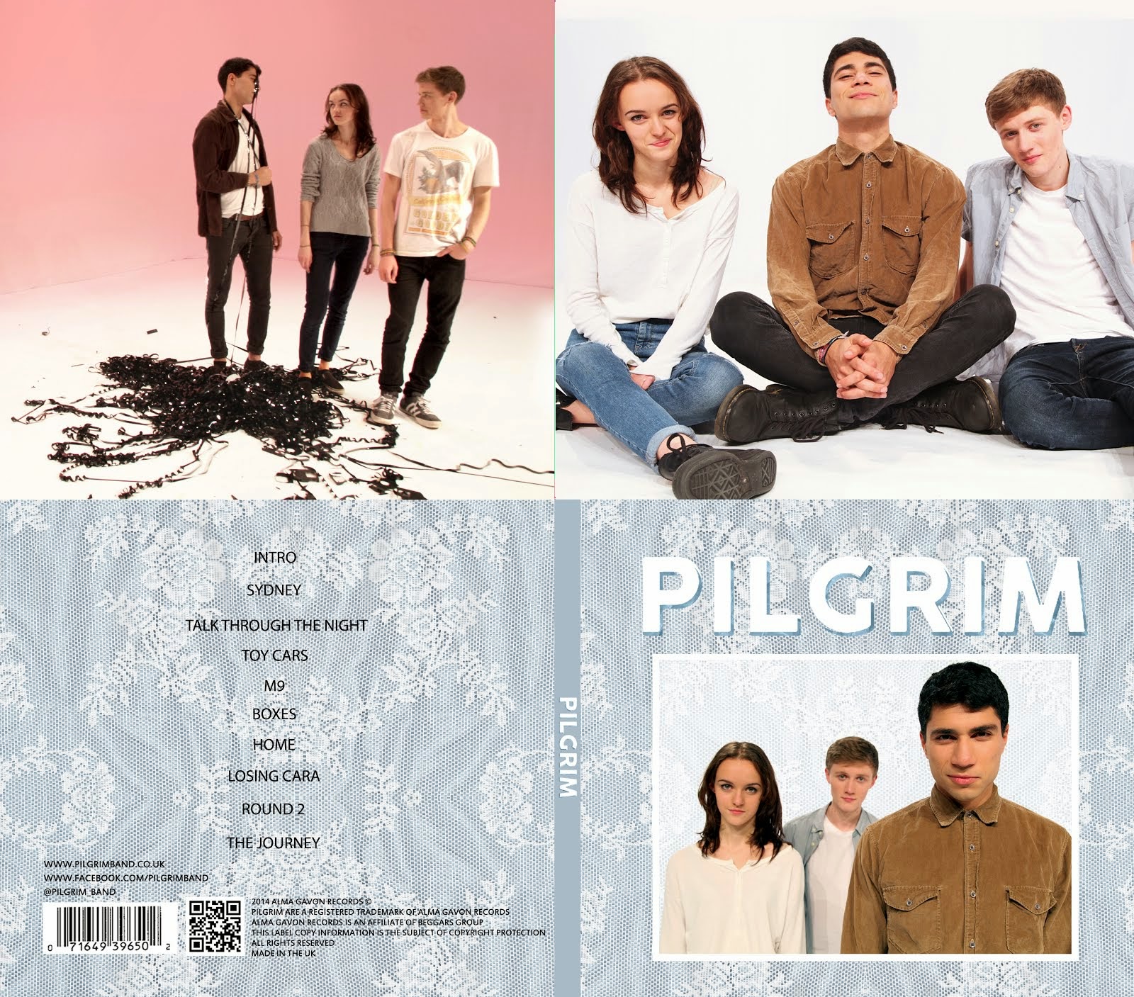
Based on the existing websites we looked at (see post: Development of Website - Influences), we designed an initial flat plan for a homepage on paper, drawn by Alice. As you can see, we have taken inspiration from the above websites to design a very visual website, using images in boxes with links to social media. The banner, the page menu bar and the links to social media will appear on each page. The background of the website will be the same texture we have used on our album, and we will use a simple, sans-serif fonts. The idea is that the page is easily updatable as it is comprised mostly of updates on social media sites such as Instagram and Twitter.
Below is a short screen-capture video that Gavin made in this early stage of our website. It shows the home page, where we have started to create boxes for different images with links to social media. We've also embedded a video into our homepage (right now it is our steal-o-matic, but eventually it will be our finished music video). Our Instagram link also opens up the picture on the Instagram website (right now a picture of George Ezra) where viewers can comment on the pictures. The overall structure of the website now is unlikely to change much, as we like the simplistic design and the use of social media being brought together all in our homepage.


No comments:
Post a Comment