


Arctic Monkeys - AM


Dan Croll - Sweet Disarray


The 1975 - The 1975
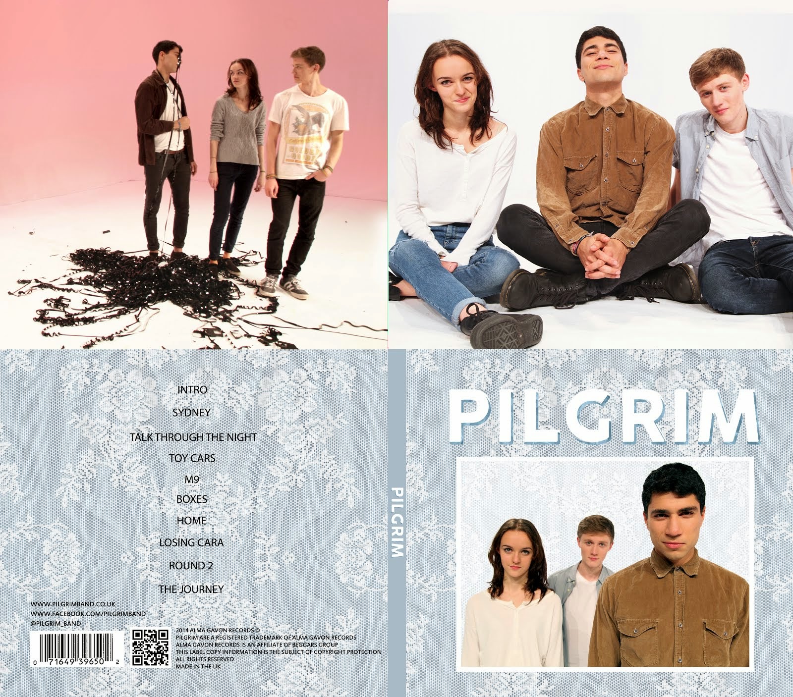
Therefore we decided to keep our blue texture on the back cover also, and have quite a simplistic design with the track listing centred. Below is our initial design for this.

We then created some track names to go in and added institutional information. We added a band website, a facebook page, a twitter page, copyright, record label (Alma Gavon Records) and parent company (Beggars Group) as shown below.

With feedback, we realised two things. First of all, there is a lot of empty space on the back cover. However, I personally quite like this, and looking at some of the existing back covers above, they often have a lot of 'negative space'. Also, we realised that we couldn't gain much credit for the image as it was found on the internet and we hadn't done much in the way of editing to it. To solve this, Mahalia scanned in a lace pattern that she had at home, and I duplicated and flipped it so that it was a continuous pattern. We also lowered the saturation to make it blend in a little better. This texture became the new texture of our front and back cover, as well as the background of the website. We think that this texture connotes a feeling of homeliness and has a vintage feel to it. Below is the final back cover of our album.

As for the inside covers, we again took inspiration from existing inside panels of indie albums, as shown below:
 |
| The 1975 |
 |
| Arctic Monkeys |

Alice and Mahalia then edited the image to get rid of the line between the floor and backdrop, and to make the pink background more even and vibrant, as well as brightening the band, the final product of which is shown below:

Through a Facebook discussion, we decided to make us a bit smaller in the image, which we all agreed worked better, but felt that there was now a lot of empty space on the back inside frame after getting feedback.


To fix this, we decided to crop the VHS tape image and put it on the inside back cover, and found a new image to go in the inside front cover.

There was a lot of disagreement at first with this image as we couldn't work out whether the angle of my head looked odd, and what kind of image it was portraying. In the end, we agreed to keep it as we thought it was quite a playful image.
Finally, we darkened the background of the spine to a block colour as it was difficult to read the white text over our lace texture.

We now had four panels for each part of our digipack. Below is our final album digipack.

No comments:
Post a Comment