OUR MUSIC VIDEO

OUR MUSIC VIDEO

^OUR MUSIC VIDEO

Pilgrim Album

Pilgrim Album

OUR DIGIPAK top to bottom, left to right: inside back, inside front, back cover, front cover.

^OUR DIGIPAK top to bottom, left to right: inside back, inside front, back cover, front cover.

Click on image to view our website

Click on image to open our band website in new window

OUR WEBSITE
My name is Kayvon Nabijou (0610). My production group number is 1 and I am working with Gavin Fraser (0245), Mahalia John (0345) and Alice Cahill (0130). This blog can be navigated by using the labels list on the right hand side of the blog.

Friday 19 December 2014

Final Editing

Once grading was finished, there were two main differences we added to the video before we were finished with it. Firstly, Gavin thought it would be a good idea to scale up some of the shots slightly as they looked a bit empty, for example, the monopoly shot:


before scaling up
after scaling up
It was a small difference, but it makes the shot look a bit more full. However, we could only scale up a maximum of 15%, otherwise the loss of quality would be noticeable.

Secondly, we needed to add a title on the last shot. There were two reasons for this. Firstly, from our most recent audience feedback, we realised that we needed to have a clearer ending, and so using a title with the band and track name would bring the video to a clear ending. Secondly, it's the last thing that the viewer sees in the video, creating a synergistic brand with the video and the band. We got this idea from lots of existing music videos:

George Ezra - Blame it on me
Dinosaur Jr - Watch the Corners
M83 - Midnight City
Below is how we used text over our image. Our text is a lot bigger and is clearly the focus of the image as the band in the background are out of focus slightly.


Thursday 18 December 2014

Music Video: Third Cut


In this cut, the main differences are that the close-ups of Gavin and Alice with 3D glasses have been removed, we added a couple more MCU's of Gavin and Alice lip-syncing, and the final section of the video now has a much faster editing pace, as well as some extra shots being added in this section such as the handheld shots of us messing about on the floor with confetti.

We made our feedback much more focused this time, asking a set of people, some media students, some not. We asked a few set questions:

  • What genre does this music video fall under?
  • Who do you think is the target audience?
  • What is the message conveyed by the video?
  • Describe the band.
  • Favourite part?
  • Least favourite part?
The majority of our feedback was positive and what we were hoping for. The main thing we picked up on from feedback is that the ending isn't clear enough. To fix this, we added a title of the band and track over the last shot and got rid of the fade on the last shot to establish a clear ending.

Tuesday 16 December 2014

Grading

Once we finished our choices on order of shots, we moved on to grading. We weren't planning on doing anything controversial with grading - our main focuses with grading were skin tone and background colour. As some of the white light washed out the background colour a little bit, we could now work on this to make the shots look much more vibrant.


The split-screen on the right shows the difference between the original and graded shot. the left half of the screen is ungraded, and the right half is graded. To get this effect, we used the 3-way colour corrector to make the blues more vibrant. We also used ProcAmp to turn the brightness, saturation and contrast up for this particular shot.


Grading didn't take as long as I had expected it to, because a lot of our grades we could copy onto other shots with the same set-up, meaning it only took a few days from start to finish amongst other things.

Music Video: Second Cut


Our second cut was changed by us looking very carefully through the video and deciding on what shots we wanted to remove, insert, extend or shorten. Gavin and Mahalia wrote up a list of adjustments to make and we worked through the video to change these, mostly done by me and Gavin.

list of changes from 1st to 2nd cut
We decided that the whole end section from 2:20 to the end was too slow paced, and so wanted to increase the pace of editing in this section to give the impression of a climax. There were also a few clips we weren't sure we wanted to keep in, such as the 3D glasses CU's of Gavin and Alice.

Monday 15 December 2014

Development of Website - progress 3

We have now finished our final website. We have added a lot of visuals to the website to make it more visually appealing to viewers, and altogether more immersive for the audience to really get involved with the band through competitions and social media.

On the home page, we have added a banner which scrolls automatically, or the viewer can flick through it. It gives the home page some movement and allows for more information to be shown. There are four different 'slides' on the banner: 'Debut Album', 'Tour Dates Announced', '20% Off' and 'Competition'. The first and third slides link to the store, the second slide links to the tour page and the final slide links to the competition page.


We have also added some more links to Instagram and Twitter, as well as some other places we are playing at such as Winter Wonderland and Rough Trade in Brick Lane. I'm very happy with the updatability of our home page now, as it has so many links to social media that are regularly updated.

We have now added our finished music video to the video page. Towards the end of editing our music video, we decided it might be a good idea to create a 'behind the scenes' video for our music video, as we found that lots of indie bands and artists had done the same, a few examples of which are shown below:


George Ezra


Dan Croll


Lewis Watson


And here is our behind the scenes video:


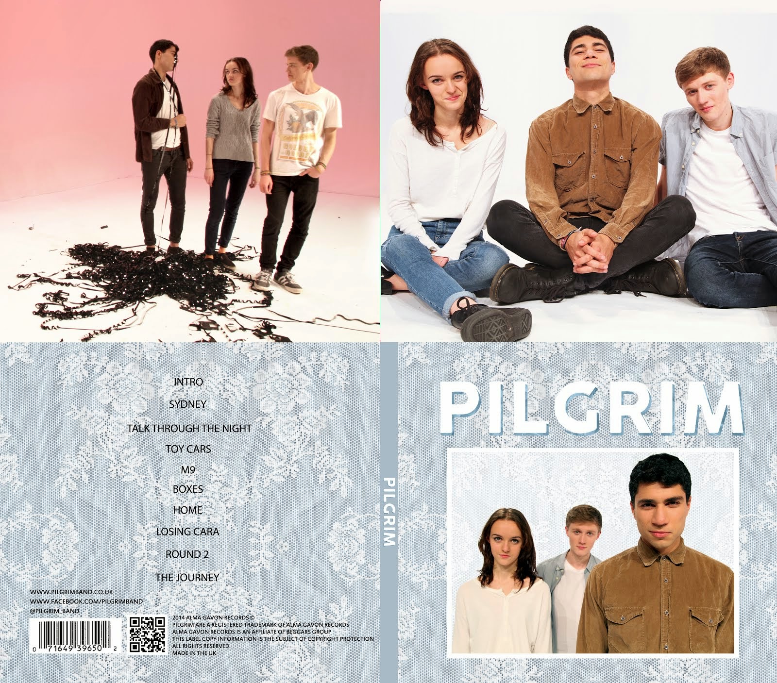
We now also have a full gallery. We have two sections of the gallery: 'Music Video Shoot' and 'Promo Shots'. It took a long time for us to edit all the pictures, as we had pictures for two different folders - around 100 pictures in total. Editing a picture involved getting rid of the line between the floor and the wall, and then trying to make the colours as vibrant as possible and making sure we were all bright enough.


The rest of the pages that we wanted to add are now also finished, such as the 'sign up' page, the 'free EP' page and the 'contact us' page. We felt that all of these features allow viewers to have maximum interactivity throughout the website, as well as making the website more personal, as they can send the band messages, creating a personal relationship between the fan and the band.


Feedback on our website showed that we needed consistent visuals across the website, especially on the tour page, where we had no visuals at all. To fix this, we added a picture on the top of the tour page, shown below.


Finally, me and Alice added institutional information at the bottom of each page:


Alice then added some institutional pages that the different texts link to, and I linked the Alma Gavon website to Beggars group, as Beggars is the parent company. Below are the Alma Gavon 'contact us', 'privacy policy' and 'terms & conditions' pages.


Friday 12 December 2014

Development of Website - Competition

We decided to have a competition on our website. This was to allow the audience to interact with one another and with the band. It also encourages viewers to use the social media pages of Pilgrim; in this case, Twitter. Me and Alice brainstormed some ideas for a competition idea that would convey our personalities and also strengthen the bands image of a slightly playful, nostalgic and vintage feel. We therefore decided to make the competition such that the competitor would have to tweet a description of their favourite childhood toy. We hoped that this would make viewers feel closer and more personal to us. The prize is a signed copy of the album, a day with the band members, and VIP tickets to their London gig. We hoped these prizes, especially the second one, would make us come across as a very friendly band who valued their fans. Below is the competition image on the website.


Wednesday 10 December 2014

Development of Website - progress 2

After we had a clear idea for our homepage and we had started to fill it with content, Mahalia and Alice drew up flat plans for the other pages, shown below.


We also have a few other pages we would like to include, such as the remaining bio pages, using the same bio template, a gallery, a sign up page and a contact page. Mahalia started working on the pages we had flat plans for on Wix.

Meanwhile, me, Gavin and Alice started researching some typical merchandise that features on websites. For this, we looked primarily at Lewis Watson, an indie artist with a similar target audience to Pilgrim. Below is the store page from his website.


From looking at this store, we wrote up a list of different items that we would like to feature on our own store, shown below.


We included typical items we'd seen on lots of band websites such as t-shirts, hoodies, mugs, keychains and bags. As well as the Pilgrim CD, we also decided to offer a digital download. We also added a vinyl version of the album and an EP also, as there has been a recent surge of people buying records, especially indie fans who are trying to find something different.

Gavin made another progress video, shown below, where he has shown the changes since his last video, featuring the pages that Mahalia mainly worked on. We still have a lot that we'd like to add, such as a landing page, and there are some basics that we still haven't started such as the 'sign up' page and the 'contact us' page. We also need to add some institutional information at the bottom of each page that will link to different pages, such as an Alma Gavon page and perhaps a link to Beggars website.

Development of Website - Posters

Me and Gavin were discussing what other items we could put on the store, and decided that posters are very typical of indie bands and artists, as indie fans often become very immersed in certain musicians and take their music very seriously, therefore often have posters on the walls of their room. Gavin drew up two main poster designs (right and below) based on two publicity shots we had that we thought would make good posters, one portait and one landscape. As we are a new band, we decided to use fairly conventional poster ideas with nothing too conceptual. This is also fairly typical of indie band posters, as well as strengthening our band image. The posters will be priced at around £5 to make them affordable and therefore will make more people buy them.


Me and Gavin then loaded the images on photoshop and edited them to look cleaner and more vibrant. We also added the text on top of the image, and made two copies of each poster, one with the original background and one with a textured background, shown below.


We liked these two especially going together, as the landscape one portrays a more fun, energetic band, whereas the portrait one portrays a slightly more serious band. They also connote a clear branding for Pilgrim as they have the big band name with the band font across them, and possibly will have a textured background, the same texture we use on the album cover and website.

Thursday 4 December 2014

Development of Website - Initial Design and Progress


Based on the existing websites we looked at (see post: Development of Website - Influences), we designed an initial flat plan for a  homepage on paper, drawn by Alice. As you can see, we have taken inspiration from the above websites to design a very visual website, using images in boxes with links to social media. The banner, the page menu bar and the links to social media will appear on each page. The background of the website will be the same texture we have used on our album, and we will use a simple, sans-serif fonts. The idea is that the page is easily updatable as it is comprised mostly of updates on social media sites such as Instagram and Twitter.

Below is a short screen-capture video that Gavin made in this early stage of our website. It shows the home page, where we have started to create boxes for different images with links to social media. We've also embedded a video into our homepage (right now it is our steal-o-matic, but eventually it will be our finished music video). Our Instagram link also opens up the picture on the Instagram website (right now a picture of George Ezra) where viewers can comment on the pictures. The overall structure of the website now is unlikely to change much, as we like the simplistic design and the use of social media being brought together all in our homepage.

Wednesday 3 December 2014

Development of Album Cover

From our final shoot, we had lots of publicity shots to choose from. Below is the shot we liked the most because it connotes a playful, approachable band and the tightness of the band really comes across in it.


We then made two main designs for our album cover using this picture, shown below. The papery texture cover was a main design we had used when creating prototype album covers using existing band publicity shots, and so it was very quick to create that. The other one took a bit longer, because we wanted to try to establish a clearer, more vibrant colour scheme of white, grey and blue. We experimented with where to put the text to use the space best.


Whilst we had all agreed on the image to use, I had initial issues with the picture. First of all, I found that lots of album covers of indie bands have slightly more 'serious' or stylised album cover images if they have a picture of the band on them. Second of all, whilst the image does show our whole bodies, I felt that we look too small in the context of the whole album cover.

We then decided to get some audience feedback on the two album covers we had made from some fans of indie music. The general consensus was that the blue design was preferred, but the text needed to stand out more. To do this, we decided to add a shadow to the text.


We then got more feedback from the same group. They said that the text was much clearer, but looked a bit amateur and like something out of WordArt. We then tried a number of textures overlayed onto the text shadow, and finally agreed on a final front cover for our album, shown below.


I think this worked well because the texture of the text shadow blends nicely with the background texture, but also helps the text to stand out. I'm also happier now that we are bigger in the image so that we look more open and approachable.

Shoot Reflections (Thursday 27th Nov)

This was our final shoot. We had the studio booked from 9:30 to 17:45. It was good that we had a large chunk of our time for the final shoot, and that we had 3 school days before the shoot so that we could sufficiently plan for the shoot and make sure that we got every shot that we needed. In this shoot, we shot the remaining prop shots and performance shots, as well as some superhero shots. Below is the shot list for the shoot.


Once we had finished all of our music video shots, we had about 45 minutes to get more publicity shots as well as shots for the digipack and website. Below are some of the shots we took.


I think we finished our final shoot feeling that we had enough footage to produce a full music video and we were happy with the quality of footage.

Music Video: First Cut

Below is our first draft of our music video where the whole song is filled with footage. There are lots of changes that we want to make, especially now that we have finished shooting all our shots and pick-ups and have some better footage of some earlier footage we shot. 

Monday 1 December 2014

Development of Website - Inspirations

rWe had a fairly clear idea of what type of website we wanted to make, but we decided that we would like to finish or come close to finishing the album cover first so that we had a clear idea of branding with which to work with on our website. Whilst we were working on our album cover and music video, we spent some time taking influence from existing websites for bands/artists. We found a few that matched a similar format to that of which we were thinking, shown below:

Rizzle Kicks


We especially liked this website, as it had links to different social media sites such as Instagram and Twitter. We also liked the simplistic layout of this website.

The 1975


We liked the clear colour black and white colour scheme on this website, as well as the layout and the extensive use of images in boxes.


Dan Croll

We like the simplicity of this website, as well as the clear synergy between this and the other media texts Dan Croll has, such as a music video and his album.


Dog is Dead


We liked the landing page that Dog is Dead use, as it can be used to quickly establish the brand/style, or promote another media text.

We will then use these websites as influences for our own website design.