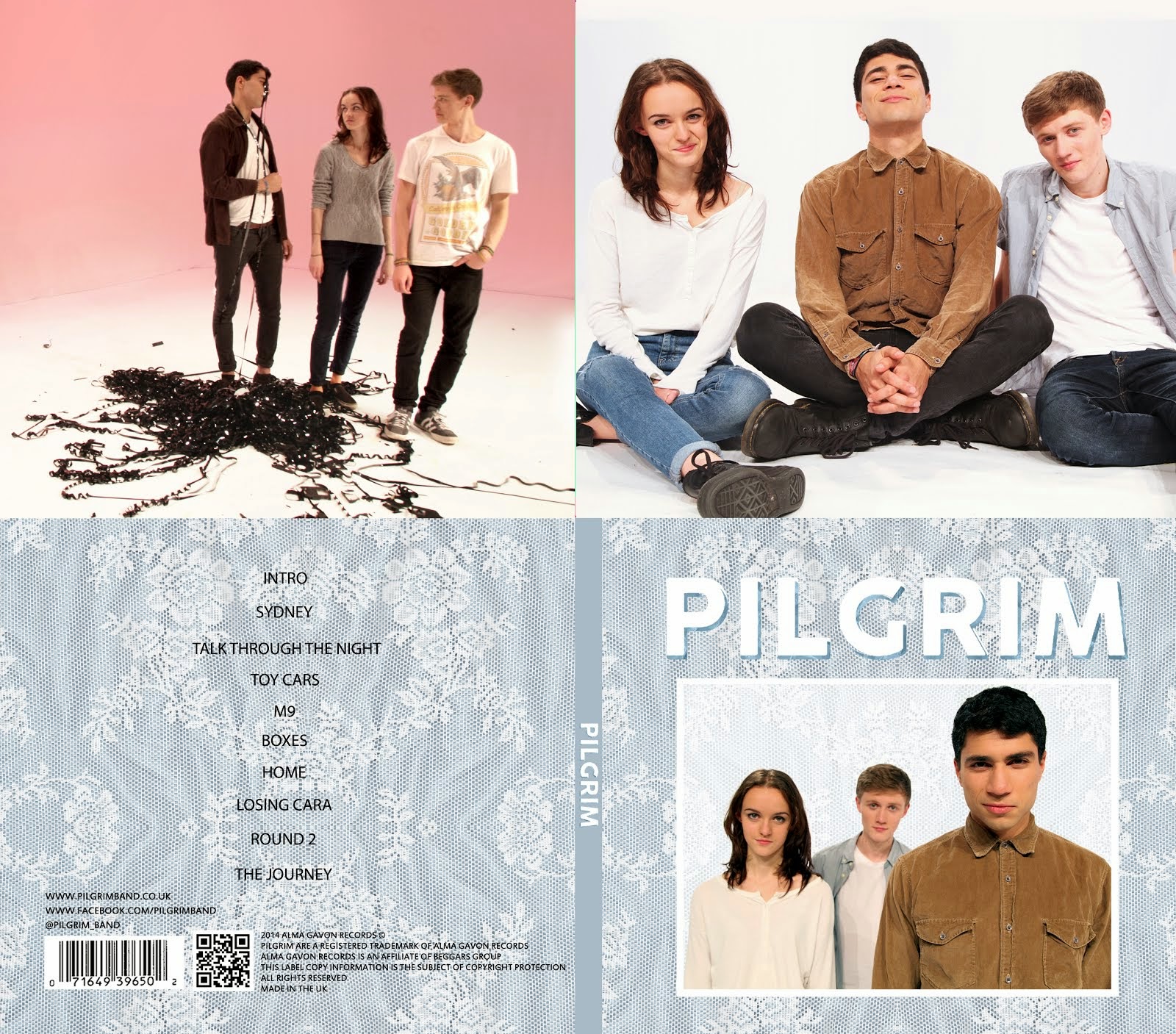


We then made two main designs for our album cover using this picture, shown below. The papery texture cover was a main design we had used when creating prototype album covers using existing band publicity shots, and so it was very quick to create that. The other one took a bit longer, because we wanted to try to establish a clearer, more vibrant colour scheme of white, grey and blue. We experimented with where to put the text to use the space best.


Whilst we had all agreed on the image to use, I had initial issues with the picture. First of all, I found that lots of album covers of indie bands have slightly more 'serious' or stylised album cover images if they have a picture of the band on them. Second of all, whilst the image does show our whole bodies, I felt that we look too small in the context of the whole album cover.
We then decided to get some audience feedback on the two album covers we had made from some fans of indie music. The general consensus was that the blue design was preferred, but the text needed to stand out more. To do this, we decided to add a shadow to the text.

We then got more feedback from the same group. They said that the text was much clearer, but looked a bit amateur and like something out of WordArt. We then tried a number of textures overlayed onto the text shadow, and finally agreed on a final front cover for our album, shown below.

I think this worked well because the texture of the text shadow blends nicely with the background texture, but also helps the text to stand out. I'm also happier now that we are bigger in the image so that we look more open and approachable.
No comments:
Post a Comment