OUR MUSIC VIDEO

OUR MUSIC VIDEO

^OUR MUSIC VIDEO

Pilgrim Album

Pilgrim Album

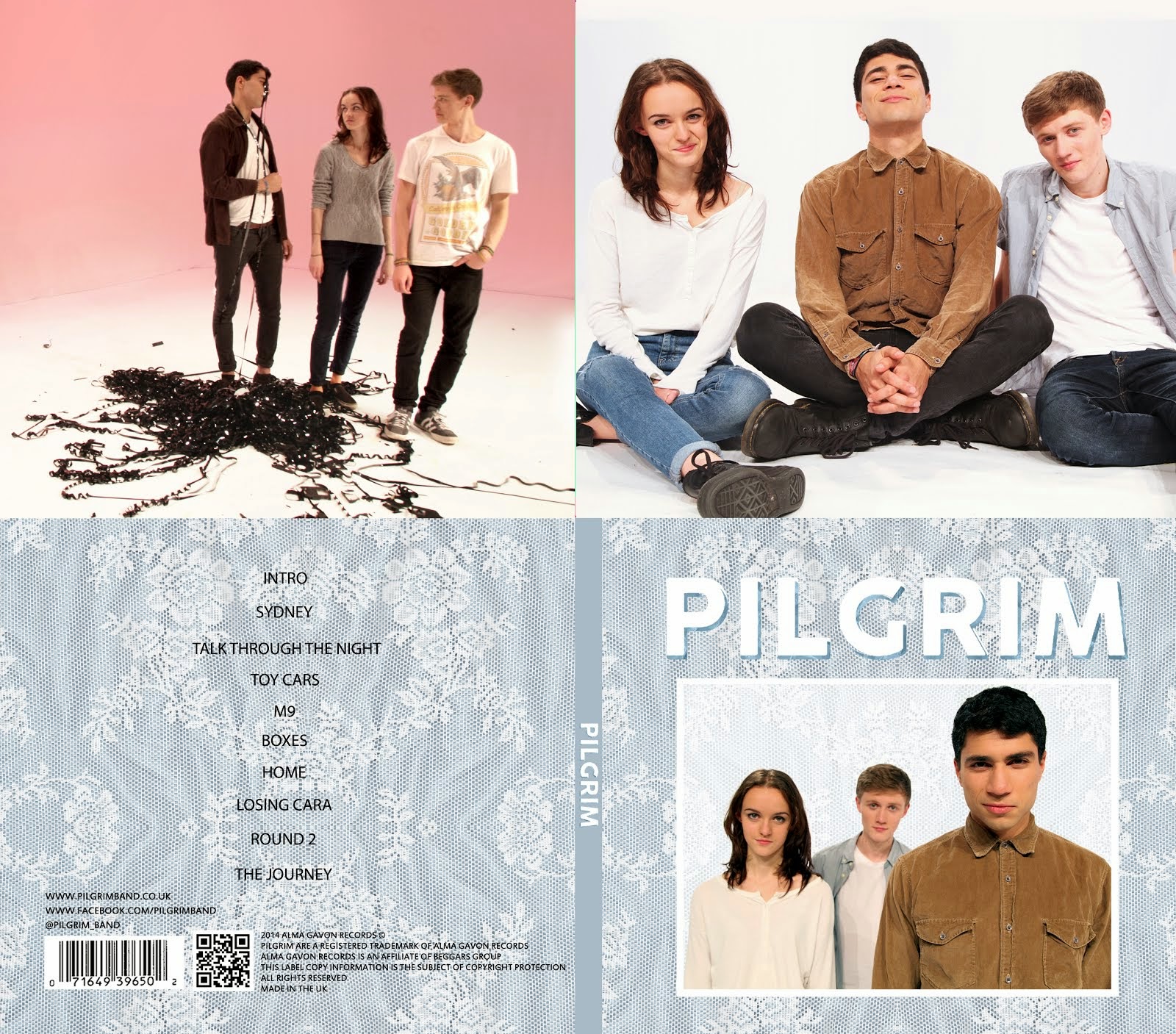
OUR DIGIPAK top to bottom, left to right: inside back, inside front, back cover, front cover.

^OUR DIGIPAK top to bottom, left to right: inside back, inside front, back cover, front cover.

Click on image to view our website

Click on image to open our band website in new window

OUR WEBSITE
My name is Kayvon Nabijou (0610). My production group number is 1 and I am working with Gavin Fraser (0245), Mahalia John (0345) and Alice Cahill (0130). This blog can be navigated by using the labels list on the right hand side of the blog.

Thursday, 26 September 2013

Film Opening Continuity Analysis


The opening of Donnie Darko starts with a pan across some trees to a wide shot of mountains and a figure lying in the middle of the road. The camera then arcs round behind the figure and we see his face for the first time. The first shot lasts about 70 seconds, keeping the audience in suspense as to why this character is lying in the road in his pajamas next to his bike. The next shot is a wide pan across mountains, before the character stands up into shot, making him seem isolated from the rest of the world. He then turns around to face the camera and has a creepy smirk on his face before walking out of frame, suggesting he is troubled or disturbed in some way, also signified by a shadow over his face. The film title then appears on the screen before a white blast of light fills the screen with white.

The next sequence is Donnie riding his bike home. This is shown by many track shots following Donnie, as well as some point-of-view shots and various angled shots to show his (and the audiences) disorientation and confusion as he slowly arrives back in the town. There are some slow-mo shots of his family getting on with their daily life - Donnie's dad blowing leaves off the lawn, his sister playing on a trampoline, his mum reading a Stephen King book - all juxtapositioning their ordinary lives to his slightly extraordinary situation at the moment. 

In this opening sequence, lots of mid shots and long shots are used to establish setting and overall character purpose without delving too deeply into their personalities other than what they are doing in the shot (e.g. Donnie's father has a good sense of humour as he blows Donnie's sister with the leaf blower). There is one close up of Donnie at the start, to give an enigmatic insight into his character. This prevents the audience from getting confused as there are no big jumps between shot framings. As most of the opening sequence is motion shots, there isn't as much of a risk of breaking the 30 degree rule, and this opening sequence does not.


Accident Sequence Analysis


This is the continuity sequence of an accident we shot of two people running into each other and one knocking the other out by slapping him against the wall.

Our first shot was a master shot to establish the setting of the scene as well as spacing between the characters. We also made sure that we didn't have any big framing jumps in our sequence (e.g. LS to CU) by including mid shots between the master shot and the close up of one of the characters sliding down the wall. There is also some match on action between the character being slapped and them sliding down the wall.

In hindsight, we would try to not break the 180 rule on shot 2 as the camera is now on the other side of Harry. We could also try and make the cuts between shots slightly tighter so there is no pause between the dialogue shots and me getting slapped.

Friday, 20 September 2013

Film Opening


Fight Club is a psychological thriller about an unnamed insomniac (often referred to by viewers as The Narrator as there is an undiagetic narration by him throughout the whole film, the source of information for much of the plot of the film) who struggles with his issues with consumerism and sets up a fight club, initially as a way of dealing with his daily life.

The opening starts with the camera moving backwards through what we find out to be the brain of The Narrator. The dark, flashing lights and fast rhythmic music immediately anchor the overall eerie and fast-paced atmosphere of the film. The camera eventually comes out, up the barrel of a gun and The Narrator is seen for the first time in a very graphic way with sweat pouring down his face and his eyes wide. This is very enigmatic for the audience as there is no build up to this situation. We hear the holder of the gun talking to The Narrator as he looks out of a skyscraper window but do not see his face, again creating a sense of mystery and confusion for the audience, as well as anchoring the genre again with with genre specific iconography such as the gun. The gun holder is introduced by The Narrator as Tyler, but no more is said about this character in the sequence so we do not get any insight into his character or importance in the film. The Narrator then starts talking about explosives which are going to set off in the building as the camera very quickly pans down the building into the basement, showing the explosives as well as panning across into another building to show more explosives. This adds to the overall sense of confusion and unease in the audience now as there is no explanation whatsoever as to why these explosives are there. The camera then cuts back to The Narrator's face and he mentions Marla Singer, but says no more about her, before the scene ends.

The opening sequence is linear and takes place in the space of a few minutes. However, in the overall chronology of the film, this scene fits in right at the end of the film which the audience only realise at the end of the film, creating a ultimate sense of completion and a full circle, giving the whole film an interesting structure. Any overview of plot or characters is very brief or void in the opening sequence, enticing the audience and using the enigma as a hook to keep them interested.

Thursday, 19 September 2013

Film Still Analysis


Describe the shot and identify in what way it could be described as representing the genre

 This is an extreme long shot of a man in a corridor. The chosen genre was horror, anchored by the grainy, blurry effect creating a supernatural, eerie atmosphere, low key lighting and the fact that the man is silhouetted, making him seem even more ominous and scary. The straight angle shot suggests that the shot could be a point-of-view shot, giving the viewer a more active role in the shot and making them feel more exposed to the figure. The character is positioned to the right of the frame, making the corridor seem longer as well as making the figure seem out of visual focus of the viewer. The figures casual pose also is juxtapositioned with the very dark, unnerving surroundings, further implying that he is a villain. Furthermore the lack of colour makes the viewer even more unsettled and strengthening the overall surreal nature of the shot.


What was actually done to achieve the effect?

We first found a relatively thin corridor without any windows, helping with the issue of needing low key lighting during the day. We tested out some shots with normal settings to find what types of framing and angles worked best to create the desired effect. We considered tighter framing to get a more detailed shot of the figure, as well as using a lower angle, but our final framing and angle works successfully as it provides a significant sense of mystery and eeriness to the figure.


Identify what is successful about the shot

The shot follows conventions of a horror film due to the low key lighting and unsettling setting. The lack of colour and grainy effect also add to the horror aspect of the shot. The silhouette on the figure is very successful as it required a very tailored setting and it keeps the figure very mysterious as well as immediately connoting the sinister and ominous aspects of the character.


What would be done differently in hindsight?

If I were to repeat the shot, I would try slightly tighter framing on the figure in an attempt to reveal some of his character without fully exposing him to the audience, thus getting rid of the mystery surrounding him. I would also try taking a straight angle shot down the corridor so both walls are in frame, positioning the figure against one of the walls, again silhouetting his figure to keep the sense of the horror genre and the figure's creepiness.