OUR MUSIC VIDEO

OUR MUSIC VIDEO

^OUR MUSIC VIDEO

Pilgrim Album

Pilgrim Album

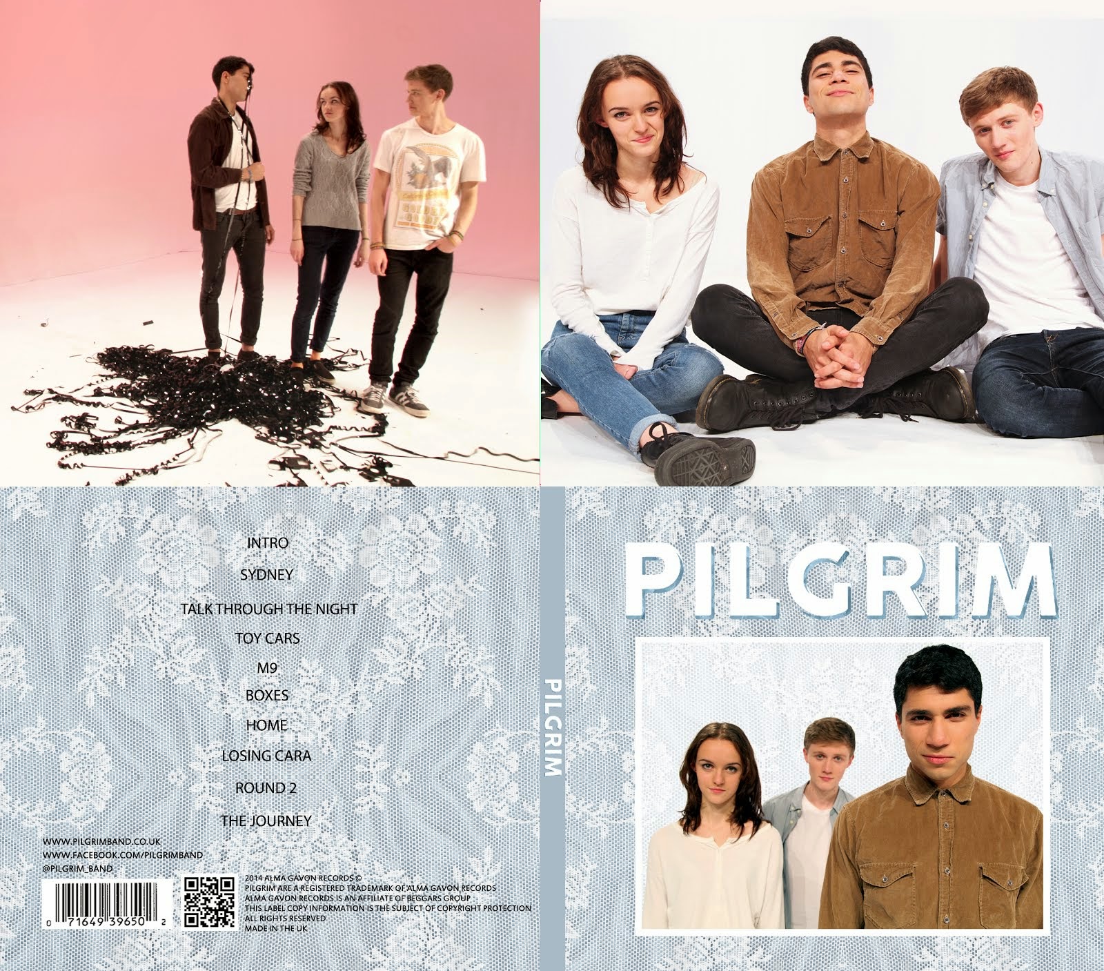
OUR DIGIPAK top to bottom, left to right: inside back, inside front, back cover, front cover.

^OUR DIGIPAK top to bottom, left to right: inside back, inside front, back cover, front cover.

Click on image to view our website

Click on image to open our band website in new window

OUR WEBSITE
My name is Kayvon Nabijou (0610). My production group number is 1 and I am working with Gavin Fraser (0245), Mahalia John (0345) and Alice Cahill (0130). This blog can be navigated by using the labels list on the right hand side of the blog.

Thursday, 28 November 2013

The Hobbit Marketing Tracking
This is one of the trailers for the film, sourced on YouTube. This is targeting a mass audience as YouTube is the largest video sharing site. This is an above the line example.
This is an article about the new trailer for the film, sourced from the Independent website. This is targeting middle class adults as this is the readership of the newspaper. This is a below the line example.

This is an interactive Middle Earth map. There is a link to it from the Hobbit Blog website. This appeals to fans of the Lord of the Rings films and the first Hobbit film, as well as Peter Jackson fans. This is an above the line example.


TV Trailer of the Hobbit on BBC1


Bus advert on a 121, goes through Enfield, Palmers Green, Southgate


Wednesday, 27 November 2013


Kill Your Darlings Marketing Tracking


This is an article on the Guardian website. This is attempting to reach middle class males and females in the UK, but as the Guardian is a popular newspaper in the UK, this will have a much larger reach. This is a below the line example.


This is the official Facebook page for the film, sourced from Facebook. This is attempting to reach a mass audience of many different types but especially reaching a younger audience in their late teens and 20s. This is a below the line example.


This is an article on the Mirror website about the film. This is attempting to reach a very big audience as the Mirror is one of the most read newspapers in the UK. This is a below the line example.


Poster at Bounds Green underground station

Wednesday, 20 November 2013


The Hobbit Overview

The Hobbit is released in the UK on 13th December 2013.
It was produced by MGM, WingNut Films and New Line Cinema, and distributed by Warner Bros.
The production budget is $200,000,000.
The Hobbit was filmed in New Zealand, but the premiere will be in LA, not in Wellington, as it was with The Hobbit: An Unexpected Journey. Whilst MGM, New Line Cinema and Warner Bros. are all American institutions, Peter Jacksons own production company WingNut Films is based in the UK.
The film is a high budget studio production.
The film is part of The Hobbit Trilogy, being preceded by The Hobbit: An Unexpected Journey and followed by The Hobbit: There and Back Again (2014). The whole trilogy acts as a prequel to the Lord of the Rings Trilogy, both trilogies being based on books written by JRR Tolkien.
The film is directed by Peter Jackson.
Stars in the film include Martin Freeman, Ian McKellen, Benedict Cumberbatch and Richard Armitage.
The film (and trilogy) follows the story if Bilbo Baggins, a Hobbit living in the fantasy world known as Middle Earth. He embarks on a journey with a group of dwarves and a wizard to help the dwarfes reclaim their home from a dragon called Smaug.
This film will already have a huge fan base of Lord of the Rings fans as well as fans of the first Hobbit film. It will also appeal to many other audiences, such as male and female young adults and older children, as well as older people 40+ who may have read the book.


Kill Your Darlings Overview


Kill Your Darlings is being released in the UK on 6th December 2013.

There are many institutions involved in the production and distribution of the film: Benaroya Pictures, Killer Films and Outpost Studios were involved in production and the film was distributed by Works UK Distribution.

The budget of Kill Your Darlings is

KYD is an American film.

KYD is an independent film.

The director is John Krokidas, also the writer and producer of the film.

As the film is set in 1944 and features some historic characters, this film would appeal to an older 30+ audience, both male and females in the ABC1 category.

Thursday, 14 November 2013

Session with Marcus
 In our session with the director, writer and distributor of Papa and Sons Marcus Markou, he talked a lot about his film making process, from funding and casting, to distribution and public awareness.
These are the main points I feel that I learned from the session with Marcus:
  • When in the shooting section of the project, Marcus knew how to get the best out of his actors due to his past in acting school and classes by assuming a more 'friendly-boss' role instead of being an intimidating director, making the whole crew feel more comfortable, meaning they all worked better and more effectively.
  • Marcus demonstrated how effectively a very limited budget can be put to use, through casting, production, and distribution. Georges Corraface, the actor playing Spiros Papadopoulos, is a pretty well known actor in Greece, and so was very effective in hooking the Greek audience, a very large section of his target audience. When distributing the film in the UK, Marcus couldn't find a suitable deal with a distributor which would end with him getting any profit, so he decided to self-distribute across Greek communities in the UK. He contacted Greek churches, played adverts on Greek radio stations and handed out flyers in Greek neighbourhoods. This is an example of how a small budget can directly hit the target audience without throwing mud at the wall and hoping some sticks, which is often the case with multi-million pound budget films.

The talk with Marcus was inspiring in the way of getting up and independantly doing something, not only in film but in all aspects of life.

Monday, 11 November 2013

Papadopoulos and Sons Distribution

Conventional methods of distribution were used when advertising the film. A trailer was made as well as a poster, and director Marcus created a website for the film with updates on the progress of production. Papadopoulos and Sons did very well through social media such as Facebook and Twitter, especially in the Greek community.


Marcus also did self distribution in the UK, such as calling up lots of Greek churches and trying to get the film spoken about in the Greek community, which worked very affectively as Georges Corraface is a very popular actor in Greece. He also took the film to different film festivals, trying to give the film maximum exposure, which it received after winning an award.
Papadopoulos & Sons Overview


Papadopoulos is an independent British film in the comedy-drama genre, generally described as a feel-good family film. It was self distributed by the director Marcus Markou, through his own company Double M and by Cineworld. The budget for the film was £850,000. Although the film was only meant to run for one week in a limited number of screens across the UK, the run was extended and expanded to more venues due to unprecedented audience demand. The film is currently rated 6.2 on IMDb.

The film is about a Harry Papadopoulos, a successful businessman with Greek origins. When he loses everything during a banking crisis, he re-unites with his older brother to re-open a chip shop they used to run together. He soon discovers other important parts of life other than money.


Friday, 25 October 2013

Shrek Sweded Evaluation

I worked with Gavin and Josh for this project. We planned a marketing scheme and scripted, acted in, filmed and edited our film. Alice, Mahalia and Molly also acted in our film.
Our marketing scheme consisted of a Facebook page and Twitter feed consisting of our trailer and pictures as well as Shrek trivia. We also released posters around the school and created a teaser trailer which went on YouTube a few days before the release of the film.


YouTube Trailer: 

This is our twitter page:
This is our Facebook page:

This is our poster:
I very much enjoyed this project as we had a lot of freedom in our shooting style due to the nature of Sweding and our zero budget. I also had a lot of fun working with Gavin and Josh.


Sunday, 13 October 2013

Dexter Title Sequence Evaluation

Summarise the conventions of title sequences that were most important to this task

For this task, we had to consider styling, size, colour and placement of titles to supplement the footage in the sequence and to help establish the genre and style of the TV show. They may also evoke certain reactions from the audience such as unease or comfort. The placement of the titles is not important in establishing genre but in drawing the audience's attention to certain parts of the frame in the opening sequence, keeping the audience's eyes moving through different areas of the frame, making the opening sequence more exciting.


How did our group plan to edit the title sequence? 

We started by watching the whole sequence, and then went through again slowly, finding where there was suitable space for titles that wouldn't detract but compliment the sequence. This way, the key cast and crew's names could be shown without annoying the audience.

Explain the creative decisions made by our group.

While we initially considered keeping a consistent styling on the titles throughout the sequence, we ended up having different styles on each title to try and cleverly integrate with the sequence, such as using the mosquito slap shot right at the beginning of the sequence to put a title, and have Dexter's hand slap the title just as it disappears. We used the 'frigid' effect a lot, which was like a jolt on the title, giving a slightly uneasy and surreal feel to the sequence. We used red and white titles mostly - red as it is an intense colour, matching the intensity of the sequence, as well as being the colour of blood, associating the sequence with crime. The font was relatively simple so as not to detract from the overall sequence.
How does our re-edit compare to the original?

The original titles are much simpler - slightly textured red font, simple font and little or no movement in titles. Our titles contained movement, effects and often more textured colours - however not always clearly establishing the genre and style of the opening sequence and the show as a whole.
Sweded Films

A sweded film is a shortened, low-budget summary of a popular blockbuster film, filmed using a camcorder. They have no special effects and often homemade props and costumes are used, relying on the audience's imagination to recreate the scene.


The site Swededfilms.com, which serves as a database for sweded movies, was registered on the 23rd February, the day after the film 'Be Kind, Rewind' premiered - the film from which sweded films originates. On February 24th, the sweded film blog 'Sweded Cinema' was launched and included rules for creating sweded films:


1. Must be based on an already produced film
2. Range 2-8 minutes in length
3. Must not contain computer generated graphics
4. Based on films less than 35 years old
5. Special effects must be limited to camera tricks and arts ’n crafts
6. Sound effects created by human means
7. Hilarious

Examples of sweded films


For our own sweded film, I thought Shrek could be a good idea to swede as it has a lot of comedy potential due to the non-human characters and their voices, as well as the fact that it is a well known film and so the audience will recognise possibly quite obscurely reproduced scenes.

Sunday, 6 October 2013

Prelim Evaluation


The brief of our prelim task was to film and edit a character opening a door, crossing a room, sitting in a chair and exchanging lines of dialogue with another character, whilst demonstrating understanding of match on action, shot-reverse shots and the 180-degree rule.


Who did I work with and how did we manage the task between us?

I worked with Alice and Shani and during planning we all played an equal part in decisions on genre, plot and shot ideas. During filming, me and Shani acted and Alice was on the camera as well as sound in shots when both me and Shani were in frame. If we experienced a practicality issue that was unforeseeable during planning, we'd jointly make a decision on what to do next. During editing, we edited 3 shots each but made group decisions on cutting points for each shot. Whilst me and Alice were more confident on editing, Shani was much more confident than myself at acting.


How did we plan your sequence? What processes/theories did we use/take in to account?

We first chose our genre as a spy thriller, and decided to have a 'Bond-like' take on the sequence. We first decided what shots we wanted to include by trying to use a range of shots in our sequence and demonstrate understanding of continuity theory. We then tried adding a script to the sequence, which proved difficult - in hindsight, I would have written the script first before shot planning. We tried to establish narrative understanding through the dialogue and iconography conventions such as Shani holding a small dog (often a cat in spy films, such as Austin Powers), which was somewhat effective but we found it hard to provide background knowledge of the situation.


What technology did we use to complete the task, and how did we use it?

We used a  to film our footage, as well as a standard tripod to hold the camera. We then downloaded the footage into premiere pro to edit our sequence. We used bins to hold and organise our footage, the source monitor to view different shots and choose in and out points to cut, and the timeline to drop our edited shots in. We used a two-track system, meaning each video and audio clip were on alternating tracks, making it easier to see where a shot starts or ends. We also changed some of the sound levels to make my voice slightly louder so that it was at the same volume as Shani's.


What factors did we take in to account when planning, shooting 
and editing?

While planning, we had to make decisions on setting, actors, props and shot types. We had to make quick decisions as we only had an hour to plan. We shot in the media block as we would definitely have permission and there was no chance of anyone ruining shots. We organised who was to bring in which props and costumes. We had very little time when shooting so we quickly got through them (although still overrunning a bit at the end), trying to abide by the 180-degree and 30-degree rules, which we managed to follow, except for the last shot in which we broke the 180-degree rule. While editing, our biggest issue was that one of our shots had Shani without glasses on when she was meant to be wearing them, meaning we had to quite drastically change our shot order and use a short smirk from the end of another shot of Shani to fill a gap between two shots of me walking. We also had to make sure the match on action fitted smoothly and there were no jump cuts.


How successful was our sequence? What would we do differently?

Overall our sequence was successful in meeting the demands of the brief, as it had a character opening a door, walking through the room and (somewhat) sitting down, as well as dialogue between the two characters. Our main issue was forgetting to put a chair in the place I would be sitting, and with it looking awkward having me sit on the table, we had to improvise slightly. In hindsight, I would block out the whole sequence at once, looking for continuity issues that may arise and planning the whole set before shooting. 


What have I learnt from this task? How will this learning be significant when completing the rest of my coursework?

I have learned how difficult it is to get the continuity of a sequence perfect and to add to the suspension of disbelief. I have also learned the main points in continuity theory, such as match on action, the 180-degree rule and the 30-degree rule. When completing my real coursework task, I can incorporate this theory with my knowledge of genre and narrative theory to create a comprehensible and entertaining sequence. I have also learned of the importance of planning all shots before the shooting slot starts, as we overran time-wise on our shooting due to indecision on shots on the day. 


Thursday, 3 October 2013


Art of the Title Grid Activity


This is the opening of our film titled 'The List', which is about a psychopath who has a list of people he is trying to kill. In the opening, he drags a dead body into his workroom and uses a saw to saw her up, before crossing her name off a list on a whiteboard.

The face of the psychopath is not revealed, apart from in the 7th shot, although he is wearing a mask so it is hard to make out what he looks like. The final shot of the list indicates the main plot of the film as this is the first name crossed off the list, suggesting he is going to try  and kill the rest.

The titles are white, which link to the night-vision effect on the camera in the opening. The titles are also simple but slightly blurry, identifying the film as mysterious and creepy, as well as the shots identifying the film as a horror.

The audience are expected to want to understand the enigmas set up in the opening, such as who the psychopath is and why he has a list of people he is trying to kill and cut up. They should also have identified the genre as a horror due to the use of props such as the saw, as well as the night-vision camera styling and the extreme high and low angles, creating a unsettling and disorienting feeling in the audience.

As a whole, the grid is successful as it sets up the plot of the film by the final shot of the list but doesn't give away too much plot detail by showing the psychopath's motives or any other main characters. The use of different shot types also keeps the audience interested in the action. In hindsight, we could have included a better insight in the character of the psychopath through use of shots including some of his personal items or a better establishment of the setting.

Thursday, 26 September 2013

Film Opening Continuity Analysis


The opening of Donnie Darko starts with a pan across some trees to a wide shot of mountains and a figure lying in the middle of the road. The camera then arcs round behind the figure and we see his face for the first time. The first shot lasts about 70 seconds, keeping the audience in suspense as to why this character is lying in the road in his pajamas next to his bike. The next shot is a wide pan across mountains, before the character stands up into shot, making him seem isolated from the rest of the world. He then turns around to face the camera and has a creepy smirk on his face before walking out of frame, suggesting he is troubled or disturbed in some way, also signified by a shadow over his face. The film title then appears on the screen before a white blast of light fills the screen with white.

The next sequence is Donnie riding his bike home. This is shown by many track shots following Donnie, as well as some point-of-view shots and various angled shots to show his (and the audiences) disorientation and confusion as he slowly arrives back in the town. There are some slow-mo shots of his family getting on with their daily life - Donnie's dad blowing leaves off the lawn, his sister playing on a trampoline, his mum reading a Stephen King book - all juxtapositioning their ordinary lives to his slightly extraordinary situation at the moment. 

In this opening sequence, lots of mid shots and long shots are used to establish setting and overall character purpose without delving too deeply into their personalities other than what they are doing in the shot (e.g. Donnie's father has a good sense of humour as he blows Donnie's sister with the leaf blower). There is one close up of Donnie at the start, to give an enigmatic insight into his character. This prevents the audience from getting confused as there are no big jumps between shot framings. As most of the opening sequence is motion shots, there isn't as much of a risk of breaking the 30 degree rule, and this opening sequence does not.


Accident Sequence Analysis


This is the continuity sequence of an accident we shot of two people running into each other and one knocking the other out by slapping him against the wall.

Our first shot was a master shot to establish the setting of the scene as well as spacing between the characters. We also made sure that we didn't have any big framing jumps in our sequence (e.g. LS to CU) by including mid shots between the master shot and the close up of one of the characters sliding down the wall. There is also some match on action between the character being slapped and them sliding down the wall.

In hindsight, we would try to not break the 180 rule on shot 2 as the camera is now on the other side of Harry. We could also try and make the cuts between shots slightly tighter so there is no pause between the dialogue shots and me getting slapped.

Friday, 20 September 2013

Film Opening


Fight Club is a psychological thriller about an unnamed insomniac (often referred to by viewers as The Narrator as there is an undiagetic narration by him throughout the whole film, the source of information for much of the plot of the film) who struggles with his issues with consumerism and sets up a fight club, initially as a way of dealing with his daily life.

The opening starts with the camera moving backwards through what we find out to be the brain of The Narrator. The dark, flashing lights and fast rhythmic music immediately anchor the overall eerie and fast-paced atmosphere of the film. The camera eventually comes out, up the barrel of a gun and The Narrator is seen for the first time in a very graphic way with sweat pouring down his face and his eyes wide. This is very enigmatic for the audience as there is no build up to this situation. We hear the holder of the gun talking to The Narrator as he looks out of a skyscraper window but do not see his face, again creating a sense of mystery and confusion for the audience, as well as anchoring the genre again with with genre specific iconography such as the gun. The gun holder is introduced by The Narrator as Tyler, but no more is said about this character in the sequence so we do not get any insight into his character or importance in the film. The Narrator then starts talking about explosives which are going to set off in the building as the camera very quickly pans down the building into the basement, showing the explosives as well as panning across into another building to show more explosives. This adds to the overall sense of confusion and unease in the audience now as there is no explanation whatsoever as to why these explosives are there. The camera then cuts back to The Narrator's face and he mentions Marla Singer, but says no more about her, before the scene ends.

The opening sequence is linear and takes place in the space of a few minutes. However, in the overall chronology of the film, this scene fits in right at the end of the film which the audience only realise at the end of the film, creating a ultimate sense of completion and a full circle, giving the whole film an interesting structure. Any overview of plot or characters is very brief or void in the opening sequence, enticing the audience and using the enigma as a hook to keep them interested.

Thursday, 19 September 2013

Film Still Analysis


Describe the shot and identify in what way it could be described as representing the genre

 This is an extreme long shot of a man in a corridor. The chosen genre was horror, anchored by the grainy, blurry effect creating a supernatural, eerie atmosphere, low key lighting and the fact that the man is silhouetted, making him seem even more ominous and scary. The straight angle shot suggests that the shot could be a point-of-view shot, giving the viewer a more active role in the shot and making them feel more exposed to the figure. The character is positioned to the right of the frame, making the corridor seem longer as well as making the figure seem out of visual focus of the viewer. The figures casual pose also is juxtapositioned with the very dark, unnerving surroundings, further implying that he is a villain. Furthermore the lack of colour makes the viewer even more unsettled and strengthening the overall surreal nature of the shot.


What was actually done to achieve the effect?

We first found a relatively thin corridor without any windows, helping with the issue of needing low key lighting during the day. We tested out some shots with normal settings to find what types of framing and angles worked best to create the desired effect. We considered tighter framing to get a more detailed shot of the figure, as well as using a lower angle, but our final framing and angle works successfully as it provides a significant sense of mystery and eeriness to the figure.


Identify what is successful about the shot

The shot follows conventions of a horror film due to the low key lighting and unsettling setting. The lack of colour and grainy effect also add to the horror aspect of the shot. The silhouette on the figure is very successful as it required a very tailored setting and it keeps the figure very mysterious as well as immediately connoting the sinister and ominous aspects of the character.


What would be done differently in hindsight?

If I were to repeat the shot, I would try slightly tighter framing on the figure in an attempt to reveal some of his character without fully exposing him to the audience, thus getting rid of the mystery surrounding him. I would also try taking a straight angle shot down the corridor so both walls are in frame, positioning the figure against one of the walls, again silhouetting his figure to keep the sense of the horror genre and the figure's creepiness.